After feedback from Mr Morris about my character model, I went back and fixed a few things.
First was a scale issue I didn’t know I had. I thought blender converted the metrics 1=1 meter, but it clearly wasn’t the case when Mr Morris took it into Unity to compare to an already existing character model, and she was 3 times taller. The fix wasn’t too difficult, I just made a few adjustments and went back and forth between programs to really make my model the same size as a preset model.
The second issue was with the smoothing groups, or more accurately the lack of them. That fix was also very easy, because I already knew how smoothing groups worked in Blender, I just didn’t know I had to turn them on before exporting (I thought, for some reason, that there is some sort of smoothing in Unity). It would’ve been tedious to re-texturize the character after I already finished a previous one, if I didn’t have issues with that previously. I made smart materials in Substance Painter for all the textures on the model, so all I had to do is drag them to the correct location.
The third issue was with the eyebrows. In my original model, they were a 3D object, separate from the rest of the body. For our purposes we don’t need that, and Mr Morris said it would be much easier further along the line if we just painted them on. Initially, I tried removing them and leaving behind just skin, so I painted them in Substance Painter from scratch, but it looked too blurry for my taste. So I assigned the hair material to the polygons I wanted to be the eyebrows (after making a few small adjustments to the geometry there, just moving vertices around for the shape of the brow, not adding), so that in Substance Painter I just had to drag the hair material on the eyebrows, and they were colored correctly.
After all of those fixes, this is how my final character looks like
I had to import the clothes from Marvelous Designer a couple of times before I found the correct way to export the UVs generated from the clothes, and the best polygon density to balance detail with amount.
I fixed a few awkward spots manually in Blender after importing (Mainly to do with the arm clipping through the sleeves which happened when I imported, and a bunching of fabric on the right hip that was there in Marvelous Designer as well). Once that was done, I moved on to modelling the parts of her outfit I couldn’t in Marvelous Designer, which consisted of the shoes and socks, bracelets, shawl, and the braids and beads that go over it.
I used the basic foot model I had already as a base for the shoe and sock, extruding and separating it from the main body. The hardest part about them were the laces winding around the ankle and connecting to the shoe, because I didn’t really know a better way beside manually placing the verts around it. I had to do it for each foot separately because it couldn’t mirror correctly.
This is the final shoe and sock
Next, I modelled the bracelets. The main challenge with them was working around the existing sleeves, and initially I just moved vertices manually, but using the sculpting tools (mainly grab, smooth, and inflate/deflate), I could move the fabric easily, so it wasn’t clipping into the bracelets. The bracelet model itself is very simple, just a cylinder with a couple of grooves to add detail.
These are the final bracelets
After that, I moved on to the shawl, which I started with the fabric part that laid over her head. I started with a plane at first, thinking I could just sculpt it to lay over her head, but that didn’t work at all. I researched how to model a Hijab, since that’s the closest article of real clothing I could think of to the shawl, and they start it using a sphere instead, which they mold to the shape of the head. I tried this approach instead and it worked much better.
I also turned off the sections of the hair that are not visible under it, since it would just be a waste of hidden faces that would unnecessarily add to the poly count.
This is the shawl
I started working on the braids, referencing this video by Dikko that I used before for the rest of the hair, but I ignored this part of it at first since I didn’t need it yet. The making of the braid itself wasn’t hard, but for some reason the positioning of it acted weirdly, so it was really hard to place it in the way I wanted. I ended up splitting the braids to 3 sections, and I added 2 beads to cover up the seams from that.
The beads themselves are just ico-spheres, with little modifications to fit what I wanted better.
This is how the braids and beads look
After that, I had to add materials to each part that wasn’t modelled in Marvelous designer (because those had materials already with their UVs), which was very simple since I already learned how to do this from the prop.
I decided that the parts will be just her skin recolored, since they’re barely visible and don’t need additional detail anyway.
From here, I moved on to Substance Painter 3D. What I discovered later on, that made me redo everything I did in Substance Painter, is that I completely forgot to UV unwrap the character (beside the clothes, because those were automatically unwrapped in Marvelous Designer).
I stepped back and redid the UVs, so instead of her face’s UVs looking like this
They looked like this
I used another video by Dikko to unwrap the face and body correctly, and the cloth models were simple enough that the smart UV unwrap in Blender could do it automatically.
After finishing that, I returned to Substance Painter 3D, and loaded the model with the correct UVs. I added materials as needed, and for the skin I used paint layers to add a bit of color variation to the face, fingers and knuckles, because it felt too uniform with just the skin material.
For the hair, I used wood material I downloaded from the community asset store, and added an alpha to make it reflect a bit. The eyes were a similar process, but I used the skin material as a base, and added filters to make it shiny. I also painted the eyes to have more hue variation in the sclera itself, and the whites of the eye.
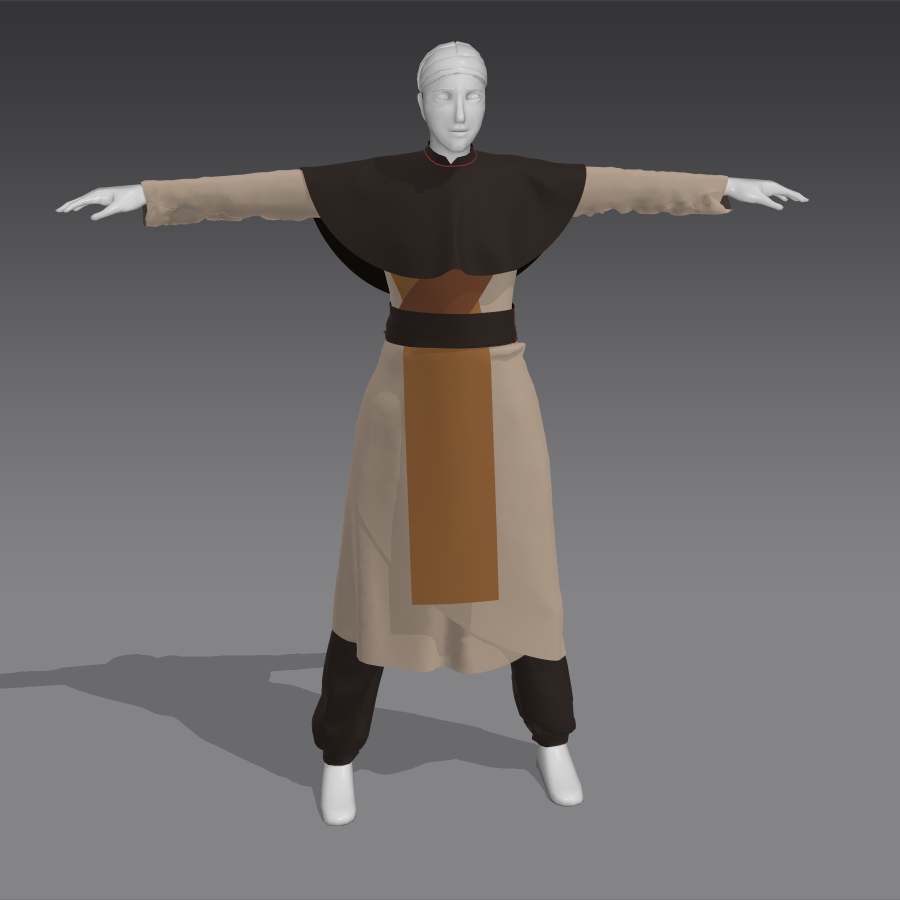
This is the final result, after texturing everything.
I think it would’ve looked better if I textured it in Blender, because it seems to me Substance Painter isn’t really designed for more stylized characters.
I’ll probably go back and change a few things next semester, but for now this is how she’s going to look.
For the environment, my initial sketch looked like this
I didn’t have a lot of time to make it, so I used a technique I don’t usually like using, because the end result looks less good in my opinion.
Mr Morris agreed and asked me to make another one, so this is the second version
It shows how things would be in a 3D space better than the first one, and is more clear on my plan. I wanted to have a rock path leading to the sunset in the background, with ruined stone walls enclosing the space. In the far background, I wanted to have a billboard forest, since I wanted it to mask the edges.
The general style of this environment was planned to be similar to my game from AND218, because my character in AND222 is the main character of the game.
I started similarly to the game, with a terrain object that I shaped to have a little bit of a dip in the middle. After resizing the terrain, the dip got more exaggerated and formed hills around the center, which wasn’t in the concept art, but I liked how they masked the edge of the world better, so I kept them.
I used a different grass texture, since the one from the game didn’t have too much detail. That didn’t end up mattering too much, since I discovered that because my terrain is this project is much smaller than the one in my game, it allowed me to have much denser grass, so the grass texture didn’t show up underneath.
For the rock path, I used the same texture as in the game. I liked the way the normal and height maps worked on it, so I didn’t see a reason not to use it.
For the stone walls, I used assets I found weeks ago originally for the game, but ended up not using. It had a curved stone wall that fit perfectly to what I wanted to have around the path.
For the billboard trees in the far distance, I used 3D prefabs in the end, since after making the game I realized it would look better compared to a billboard effect (I also don’t actually know how to make the billboard effect).
The skybox in the environment comes from the same pack as the one in my game, again because it worked well there, and I didn’t see a reason to find a different one.
My biggest issue was with the grass draw distance. I couldn’t change it to far enough that it rendered it all the way back, which created these patches that appeared and disappeared as the grass moved with the wind. In the end, I extended the path, and deleted the areas where the patches appeared manually. I don’t know if that will matter in the future, but it’s something I can easily change later on.
This is how it looks at this point
It is still a work in progress, but I think it already looks much better than my game, because I already knew a lot going into this. For the game, I had to learn everything from scratch.
There are issues with the ground having this ripple effect that I’m not sure how they appeared. Both the grass and the rock texture for the path are from the game, so I know they’re not supposed to look like that. Mr Morris suggested it might be a setting in the camera I’m using, and I’ll have to look more into it at another point in time.
I decided to make the prop a sort of candleholder, inspired by one of the concept drawings I made for my game for AND218
(the candleholders on the bottom drawing)
I made a few sketches exploring ideas for it, and ended up choosing the left one. I liked the way the stick curved on it.
For the prop, I chose to do the low-to-high method, so I had to model a lowpoly version, and a highpoly.
This is the lowpoly
When I showed it to Mr Morris, he noticed I had n-gons on all the circles (The base of the stick, the end of the cut-off branch, the candle base and the wick), so I had to fix those, but otherwise I was good to move on to the next part.
This is the first version of the highpoly
It’s just a smoother version of the lowpoly, with some changes to the branch and circle, that happened while I was messing with the model in sculpting mode.
I didn’t know what we need to exactly do yet, because this was while we were on Christmas vacation, and we weren’t given the lecture on this step yet. So, I looked up different methods of texturing models.
For the lowpoly, I tried texture painting. There’s not much to say about it, it was pretty straight forward. I used this video as a guide.
This is the final result.
For the highpoly, I wanted to look into procedurally generated materials. I knew they exist, but I knew nothing on how to make them. For the wood part, I watched this video, explaining step by step how to make the material.
And for the wick, I just used the default material, changed the hue to black, and adjusted the roughness.
This is the final result
The two textured versions turned out to be completely unnecessary for the method we were supposed to use for the prop model, but because of this I learned how to change materials of only selected objects, which I would need later on. I also enjoyed making the procedurally generated materials, and I’d like to explore this side of Blender more in the future, because I’ve seen other people do beautiful work with it.
After showing all of this to Mr Morris, he explained my highpoly is wrong, and needs much more details, and that we would add materials using substance painter. After he gave the lecture on normal maps (and other types of maps), and how they’re used, I understood what I need to do with the highpoly for its maps to be projected correctly onto the lowpoly.
I tried using the old version of the highpoly, but very quickly realized that with the amount of problems I’ll have to fix, it would be easier to just start over. So, I duplicated the lowpoly version, subdivided it, and sculpted details.
This is what I’ve come up with.
The last step I needed to do before moving to Substance Painter 3D, is to assign different materials to the different parts of the prop (wood, candle, wick). This process was very easy after what I did before with the old versions.
This is how the model looked after that, I used different colors for me to tell where each one is. I know they won’t show up in the final version.
I moved to Substance Painter after that, and the process was very straight forward. Mr Morris had already showed us how to bake maps from a highpoly model onto a lowpoly, so after that all I needed to do is choose the materials. The candle and the wick were easy, they’re the Wax and Charcoal Smart Materials that come with substance painter. I had more options for the wood, but I ended up choosing Wood Walnut. I experimented with adding an overlay of Carved Wood, a material I found on the community assets, but it didn’t look right on my model, so I scrapped that idea.
This is the final model with all materials.
I think the candle is most successful at showcasing the maps from the highpoly. If I were to do this again, I would make the details in the highpoly much more exaggerated, so they show up better on the lowpoly.
I didn’t get feedback from Mr Morris yet, so this final version can still change.
Before starting working in Marvelous Designer, I watched a video by ProductionCrate explaining its basic features and workflow. From that I understood I’ll need to do some research on cloth patterns, since with the way the program works, it will be much easier if I had a general understanding of how the patterns should look before starting to create them.
Unfortunately, because my character comes from the 12th-13th century, it was pretty hard to find actual patterns of clothes from that era. I found this pattern for a dress (I modified the sleeves), and this article for general Middle Ages fashion.
This was my way of planning the various layers of her clothes.
I had her concept art on the top left for reference, and across the bottom I sketched how each layer would look like separately. On top, I sketched how I think the patterns could look like. I didn’t know the limitations of the program (or my own skills) yet, so I just planned everything, and if I ended up not doing it in Marvelous Designer and instead in Blender, so be it.
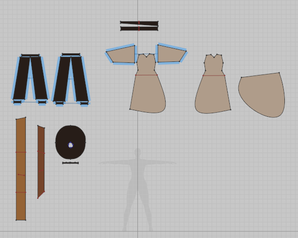
This is how she ended up looking
And these are the patterns for those clothes
I didn’t have too many issues, it was mostly a little tedious to just make a pattern, and fix it little by little until it fit correctly. There is a bit of fabric bunching under her belt on the left side of her hip and I can’t get it to smooth without ruining the other side, so I left it for now. The sleeves are loose, because I want them to bunch a little when I add the bracelets.
I tried adding shoes, but they kept clipping into the model, so I figured I could model them later in Blender. From my research, it doesn’t seem people really put bracelets in Marvelous designer, so I left it for later as well.
The shawl would not fall the way I wanted it to, no matter how much I changed the pattern. Since it will have elements over it (the braids and beads), I left that too for Blender.
Right now, I’m waiting on feedback from Mr Morris. This already might have to be scrapped, depending on how much I’ll need to fix the model, but at least I have the patterns now and know how to use the program, so if I have to redo it, it would take way less time.
After showing the model templates to Mr Morris, he suggested I do additional versions, one without clothes, and another of just the head
From there, I could start modelling the character in Blender. After showing Mr Morris all the tutorials I’ve found, he told me I should look for new ones because most of them showcased bad topography that would make for a bad model for our purposes.
I ended up finding this tutorial by Dikko on YouTube, which is a two-part series of videos, one focusing on the head, and the other on the body. His models are made for animation, and so he does use subdivision, but I looked at the final result and figured even without subdivision it will look alright. Also, because the model is created to move, the loops should work for animation. He specifically noted his models don’t use sculpting, but he did use sculpting tools for smoothing. That didn’t affect the poly count, so it wasn’t an issue.
It took me a while to get through the video, mainly because I had to keep pausing to understand the shortcuts he was doing to get the result he got. I didn’t have much experience with Blender prior to this, so I was learning the program as I progressed through the video.
My final result was this, I ended up doing some adjustments to proportions while doing the body (mainly the distance between the eyes)
After I finished this, I moved on to the body, following this video, also by Dikko. I got through it faster, because now I knew how to use the shortcuts.
One thing that was really difficult was attaching the neck to the rest of the body, because the head had way more loops compared to the body. I didn’t want to add more loops to the body, since it would raise the poly count by a lot, so I had to figure out how to turn 6 loops to 1. Eventually I managed to do that without having n-gons or triangles. The back of the head had a similar issue, but because it will be covered by her clothes, I figured having 2 triangles there wouldn’t be a problem.
After that, all I had left was the hair, which Dikko has a tutorial on too, but I didn’t follow it too closely as the hairstyle of my character is much simpler. As seen in the model template, her hair will be mostly covered by the shawl, except for the front.
Initially, I tried using bezier curves, but the controls were finicky and frustrating to me as someone that never used them. I couldn’t get them to twist the way I wanted. I tried different types of curves, and landed on the “Line” type in Blender, which works similarly to the bezier, but the handles on the ends allow for easier maneuvering, at least in my case.
This is how the hair looked halfway through
And this is the final version (I dissolved a lot of edges after finishing)
I didn’t bother making the bun at the back too detailed, but the strands are converging in a way that makes sense.
The next part will be modelling the clothes, which I will do in Marvelous Designer as Mr Morris suggested. I didn’t get feedback on the character model yet, but I’m moving on because I rather not leave everything for the end.
Making the model sheet was relatively straight forward, as I had the head done already from previous sketches, and I used the poses sheet as reference for the body. I made the front view first and used it as my reference point for the features on the side view
I’m not sure if I should add a back view as well, since some of the design features (back braids, back cloth/banner, shoes) aren’t as clear as they could be from these view points. I’ll ask Mr. Morris about that in class.
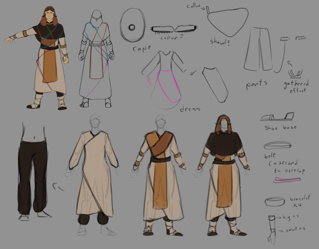
After looking at the 3 options I had, I decided to go for a mix of option B, with the cape of option A and the shoes of option C. I sketched the final design and started testing different color palettes. The main color needs to be orange, and I used mostly earth tones since these are clothes from a medieval period.
I wanted a mix of light and dark fabric, so the different elements of the outfit won’t get lost between similar values. All the options are mostly warm-toned, except one where I tried to add a greenish hue I saw in a Byzantine mural. I don’t like that option because it strays from Barya’s theme too much.
Next, I sketched different poses for Barya.
I wanted a mix of action and emotional poses. I started with a praying pose, since Barya’s central trait is her occupation as a priestess. Action poses showcase her ability to control fire, and the last one was just to see her from a straight ahead view.
After that I moved on to the face.
I started with a sort of model sheet just for the face, to solidify the location of her features before I start sketching different expressions. I also added a small sketch of the back of her head to show how the braids come together.
The expressions were pretty straight forward, I paid close attention to the eyes and nose since they look different from my usual style. I wanted to have the face in many different angles along the expressions because I thought it would help in later stages.
The last thing I need to do now before modelling is the full body model sheet, and since I already have the face, I just need to do the body.
Since the character I’m designing is inspired by a real historical period, I looked at references from the time. The period I was looking at was 11-12th century Byzantine Empire, ottoman and Bulgarian traditional clothes, as well as eastern orthodox priests, since my character is a priest.
Initially, I wanted to look over religions that ruled the area before the arrival of Christianity, since my character belongs to a religion that believes in the existence of several gods (but only worships one). Sources were hard to find so I decided to look at Orthodox Christian priests of the time. I found out modern day priest clothing keep many elements from the Medieval period, especially in the east, so I looked at them.
The hair covering in this outfit is inspired by a drawing I found in a book about historical fashion I own called “The costume history” by Auguste Racinet and published by TASCHEN. It has clothes from the Egyptian empire to the late 1800s, divided by periods and regions. I later found in Wikipedia the original photos they used for many of the drawings in the book, in sections of cultures closer to their own period.
Outfit “A”
The front cloth separating to two and the shape of the cape are the main elements I took from modern-day priests
The second outfit is inspired more by Byzantine clothes (elements from those clothes can be found in modern Orthodox priest clothes). The hair covering is once again from the book, I couldn’t find the photo reference.
[taken from number 5, second to the right]
The way the 2 fabrics overlap and cross is inspired from a mural of Emperor and Empress in the loros costume, Nicephorus III and Maria of Alania. 1074-81
The way the sleeves are cuffed by bracelets, which I added as part of Barya’s modification to the priest outfit to fit more for fighting (like I mentioned in the character profile) comes from a Justinian mosaic from the early Byzantine era.
The last outfit is more heavily inspired by the Justinian mosaic, with the hair covering being from a mosaic of Empress Theodora. Because of that, the outfit looks more regal and fit for a royal, rather than a priestess, and it’s the outfit I feel fits the least.
I think I’ll continue exploring outfit B, as it fits the most for a priestess-turned-fighter. I like the shoes from C and the hair covering from A.
As for the face, I had a general idea of what I wanted. I made the final colored face with a bit of stylistic inspirations from Byzantine art (i.e. the nose and mouth)
The colors come from the first drawing I’ve made of her, except her eyes have a brighter tone, to emphasize that part of her character design.
I still need to explore her hairstyle (the braids and beads mentioned on her character profile), and the symbols/pattern I want the fabrics of her clothes to have. Those might not be in the final version because I don’t know if it will be too hard for me to add to the model, but I assume they will be flat so it shouldn’t be that complex.
Different character design style of the genre (Horde mode games)
World War Z: Aftermath, Tom Clancy’s The Division, Call of Duty: Black Ops 2 Zombies
Realistic style, aiming to be as accurate to real life as possible. The Division and COD: Black Ops 2 Zombies are centered around military soldiers, therefore their outfits usually consist of real life gear. That gear is the main way for the designers to distinguish between characters.
WWZ: Aftermath’s characters are survivors of a zombie apocalypse, and their cloths often reflect their previous occupation before the zombies appeared. Age, ethnicity and clothing style are the main differences between characters.
Darksiders 3, Dishonored
Fantasy, more stylized.
Dishonored takes heavy inspiration from Victorian-era Britain, and takes place in an alternate reality to ours where magic is common knowledge. Character anatomical proportions are exaggerated. Social status is very prominent in all designs, and divides characters between a high social-economical background and low. The main character wears a skull-shaped mask and a hood, emphasizing the stealth element of the game.
Darksiders 3 leans more towards high fantasy settings, with less realistic proportions and faces. Takes inspiration from knight armor sets. Designs are full of death and skull imagery. A lot of little details. Main character has bright pink-red long hair and a red cape that set her apart from other characters.
Designs from games outside the genre (with PEGI rating 12 and below)
Risk of Rain 2
Highly stylized scifi style. Humanoid characters all wear space helmets because of the setting (space). RoR 2 rendering is cel shaded, and their designs are fairly simple. Characters are differentiated mainly by color and silhouette. RoR 1, the first game in the franchise, is a 2d pixel art game. Most designs of the second game come from it, so many of the design choices originated from that simpler, minimalistic style. That style required heavy use of big shapes and colors as well as silhouette to help the player distinguish between characters.
The actual character models and shaders used would be something I’d like to explore further, from a technical standpoint.
Potion Craft: Alchemist Simulator
2D early medieval style. The main interest in this style is its modernized version of the early medieval manuscript art, in the simple faces and crosshatch shading. Character designs differ with occupation, social standing and colors. It appears that many NPCs are randomly generated, with their hair and clothes mixed.
I’d be interested to explore the possibility of taking inspiration from art of the 12-13th century and including style choices in my own final design.
Target Audience
Fantasy within a medieval setting
Character designs inspired by a certain historical period with a fantasy twist.
Can be separated to 2 groups:
-Fantasy enjoyers
-Medieval/historical enjoyers
For research, since I already made a high concept document for AND218, I know a bit about the genre Barya’s game will be.
I looked at games that fall into this genre, and games that interest me in their style.
I wasn’t sure what would be the target audience, beside the fact the style would be Medieval with fantasy elements. I suppose there could be a division between girls and boys, younger and older audience. In that case, the design isn’t aimed for one gender and towards an older audience. This is reflected in the examples I looked in, but beyond that I’m not sure how to research that.
What I gathered mostly from research is that horde games often have multiple playable characters you can choose from, sometimes the choice affects gameplay and sometimes it’s purely aesthetic. Because of that, the greatest challenge is to make the characters differ enough to be recognizable from distance, while also making them appealing to a player to choose.
From the research, I also thought of the idea of using early Medieval art style for the character design. I showed an example of a 2D game that does that, but it would be an interesting challenge to make in 3D. Might be too hard for a beginner like me.
I might have to do further research after Mr. Morris gives me feedback.